Web Design
The 20-Check Inclusive Website Audit
By The Gaygency · 09-24-26 · 9 min read
Most website audits check two things: does it load fast, and does it rank. Neither question tells you whether a visitor using a screen reader can complete a purchase, or whether a customer filling out an intake form has to pick "Mr." or "Mrs." before they can book an appointment. Both are inclusion failures. Both are also, increasingly, legal and revenue problems. Plaintiffs filed 3,117 website accessibility lawsuits in federal court in 2025, a 27% increase over 2024, according to Seyfarth Shaw's ADA Title III tracking, and e-commerce sites account for the large majority of those cases.
This audit covers both halves of what "inclusive website design" means: technical accessibility for people with disabilities, and identity-inclusive design for the people your forms, imagery, and language currently assume don't exist. Thirteen checks come straight from the Web Content Accessibility Guidelines, version 2.2. Seven come from the kind of form and content review that keeps a site from quietly telling LGBTQ+ visitors, and plenty of straight and cisgender ones too, that it wasn't built with them in mind.
Why WCAG 2.2 is the standard to check against
The W3C published WCAG 2.2 in October 2023, adding nine new success criteria to WCAG 2.1 and removing one. The Department of Justice has already picked a version of this standard as law for one category of website: its April 2024 rule under Title II of the ADA requires state and local government sites to conform to WCAG 2.1, Level AA, with compliance deadlines that a 2026 interim rule pushed to April 2027 and April 2028 depending on population size.
That rule covers government entities, not private businesses. But it matters for private businesses anyway, because courts hearing ADA Title III cases against private companies have been treating WCAG as the de facto technical standard for years, with or without a formal regulation naming it. When a demand letter or a lawsuit arrives, the plaintiff's expert report cites specific WCAG success criteria. Building to WCAG 2.2 Level AA now is the closest thing to a defensible position that exists.
A rule that only binds government websites still sets the standard everyone else gets sued against. WCAG didn't become optional for private companies just because the law names someone else first.
Plaintiff expert reports cite specific WCAG success criteria, so building to 2.2 Level AA is what a defensible position looks like before a demand letter ever arrives.
The 20-check audit
Accessibility: 13 checks against WCAG 2.2
- Text meets a 4.5:1 contrast ratio against its background. (WCAG 1.4.3) Large text gets a 3:1 minimum. Run your color pairs through a contrast checker before you ship a new palette, not after a complaint.
- Text resizes to 200% without breaking the layout or hiding content. (WCAG 1.4.4) Zoom your own site's homepage to 200% in the browser. If navigation overlaps body copy or a button disappears off-screen, this fails.
- Every clickable target is at least 24 by 24 CSS pixels. (WCAG 2.5.8, new in 2.2) Small icon buttons and closely packed links are the most common failure here, especially on mobile checkout flows.
- Every meaningful image has real, descriptive alt text, and decorative images are marked empty. (WCAG 1.1.1) "image1234.jpg" and "photo of person" are both failures. So is alt text on a background image that exists purely for visual texture.
- Every video is captioned and every standalone audio file has a transcript. (WCAG 1.2.2) Auto-generated captions with heavy error rates do not meet this bar for anything beyond internal use.
- Every function on the page works with a keyboard alone. (WCAG 2.1.1) Tab through your own site with the mouse unplugged. Dropdown menus, modals, and custom sliders are where this usually breaks.
- The focus indicator is visible and is never hidden by a sticky header, cookie banner, or chat widget. (WCAG 2.4.11, new in 2.2) Tab to a link near the top of the page and check whether a fixed element covers it.
- Headings follow one logical order, with a single H1 per page and no skipped levels. (WCAG 1.3.1) A page built by styling text to look like a heading, without an actual heading tag, fails screen readers even when it looks fine visually.
- Links describe their destination without relying on surrounding text. (WCAG 2.4.4) "Learn more" repeated eleven times on one page tells a screen reader user nothing about which link goes where.
- Form fields have visible labels that are coded to the field, not placeholder text that disappears once you start typing. (WCAG 3.3.2) Placeholder-only labels are one of the most common accessibility failures on marketing sites specifically, because they look clean in a design mockup.
- Errors are identified in text, with an explanation of the fix, not by color alone. (WCAG 3.3.1) A red border with no message tells a colorblind user, or anyone using a screen reader, nothing.
- A help mechanism, whether that's a contact link, chat, or FAQ, appears in the same location on every page. (WCAG 3.2.6, new in 2.2) Moving support access around the site by page template breaks this.
- Login and account creation never require a memory or puzzle-solving test without an accessible alternative. (WCAG 3.3.8, new in 2.2) CAPTCHA-only verification and security questions with no other option both fail here.
Contrast, keyboard access, alt text, form labels, and error messages are the failures most often cited in demand letters because a plaintiff's expert can document them with a browser extension.
Representation: 7 checks for identity-inclusive design
- Name fields allow a chosen or display name, and don't force a legal name into public view. A checkout confirmation or a public profile that pulls straight from a payment processor's legal name field outs people who go by something else.
- A gender field, when the transaction genuinely requires one, offers more than two options or a free-text field, and the field disappears entirely when the transaction doesn't need it. Most forms ask for gender out of habit, not necessity. Shipping a package doesn't require it.
- A pronoun field, if you include one at all, is optional and free text rather than a locked dropdown of two or three choices. A locked list solves the problem for some visitors and recreates it for everyone else.
- An honorific field (Mr., Mrs., Ms.) is optional on every form that includes one, never required. This single required field quietly blocks completion for anyone who doesn't use one.
- Site photography shows a real range of people across body type, age, race, and family structure, rather than one diverse-looking stock set reused on every page. A single token photo doing all the representation work reads as exactly that once a visitor notices the pattern.
- Checkout and booking forms don't tie unrelated choices, like clothing size or room type, to a binary gender selector. Sizing and preferences should be selected directly, not inferred through a gender field acting as a proxy.
- Legal pages, support scripts, and confirmation emails are checked for language that assumes one kind of family or relationship structure. "Husband and wife," used as the only example in a terms-of-service template, is a small thing that customers notice.
Three checks you can run right now, in under five minutes
- Zoom your homepage to 200% and see what breaks.
- Unplug your mouse and tab through your own checkout flow.
- Open one form on your site and check whether gender or an honorific is a required field.
None of these twenty checks require a redesign. Most of them are a form validation rule, an alt attribute, or a CSS value someone forgot to set. The cost of fixing them is a few hours of development time. The cost of not fixing them is a lawsuit, a lost customer, or both.
How to prioritize when you can't fix all twenty at once
Small teams should not try to close all twenty gaps in one sprint. Start with the checks that carry direct legal exposure: contrast, keyboard access, alt text, form labels, and error identification are the five most commonly cited failures in accessibility demand letters, because they're the easiest for a plaintiff's expert to document with a browser extension. Fix those first. Then move to the representation checks, which cost little to implement but compound in how a visitor reads your brand: a chosen-name field and an optional gender field take a developer an afternoon, not a quarter.
If your site was built recently on a modern framework, most of the WCAG basics may already be handled by your component library. The gaps tend to show up in custom-built forms, embedded third-party widgets, and older marketing pages nobody has touched since launch. That's where an audit earns its keep: finding the specific pages and components where the defaults broke down, rather than re-litigating the whole site.
This is also where the two halves of the audit connect back to the rest of your marketing. A site that fails keyboard navigation on its checkout page is losing revenue the same way a site with a broken conversion funnel is, and it shows up in the same measurement and analytics you're already reviewing. And accessibility work overlaps directly with technical SEO: clean heading structure, descriptive link text, and fast, well-coded pages are graded by the same crawlers that grade your rankings. If your last website build predates 2023, it predates WCAG 2.2 entirely, and a fresh audit against the current standard is worth the afternoon it takes.
E-commerce carries the most exposure here. Testparty's 2025-2026 tracking of Seyfarth Shaw and UsableNet data puts online retail at roughly 69 to 77% of all federal website accessibility filings, which makes this audit close to mandatory for any fashion and e-commerce brand running its own checkout, small teams included.
Frequently asked questions
Do I need to hire a lawyer to know if my site is compliant?
No. WCAG 2.2 success criteria are public and testable with free browser tools: contrast checkers, keyboard-only navigation, and screen reader extensions like NVDA or VoiceOver will surface most of the twenty checks above without legal review. A lawyer becomes useful once you've received an actual demand letter, not before.
Is WCAG 2.1 AA enough, or do I need 2.2?
WCAG 2.2 includes everything in 2.1 plus nine additional success criteria, so building to 2.2 automatically satisfies 2.1. Since 2.2 is the current published version as of this audit, there's no reason to target the older standard for new work.
Does adding a pronoun field to every form help anyone?
Only if it's optional and genuinely useful to the transaction. A required pronoun field on a pizza order form helps no one and annoys most people who fill it out. The goal is removing unnecessary gendered fields and making the ones you keep genuinely optional, not adding fields for their own sake.
Can an accessibility overlay widget replace this audit?
No. The Department of Justice, disability advocacy groups, and most accessibility experts have been consistent on this: overlay widgets that promise instant compliance through a script tag do not fix underlying code issues and have themselves become a target in a growing share of lawsuits. Fixing the markup is slower but it's the only approach that holds up.
How often should this audit run?
Once at launch, then again any time you add a new form, checkout flow, or major page template. A full twenty-point pass once a year catches the drift that happens as a site grows past its original build.
A site that fails half of these checks isn't unusual. It's the default outcome of building fast and reviewing later. Book a call and we'll run the audit on your site and tell you exactly which of the twenty checks need attention first.
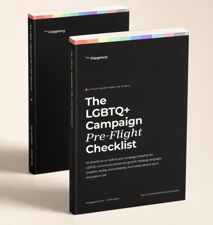
Free campaign guide
Would your campaign pass pre-flight?
The same 42 checks we run inside the studio before any campaign aimed at the LGBTQ+ community goes live.
Delivered by email. No spam, ever.
Written by
The marketing and advertising agency for LGBTQ+ businesses and the brands that back them. Strategy, media buying, and brand systems with published results.
See the work